For packaging design ideas and nets refer to scetchbook pages
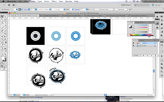
I tried to produce a few simple variants of the logo to fit as a stand alone image on the packaging with the idea to potentially screen print it with a single colour, i knew the top of the box would be sqaure so i measured out the frisbee and then started to design to a sqaure format.

Black stock with white screen print over the top or with a glossy print, black on black.

Black stock with white screen print over the top or with a glossy print, black on black.

Some idea's with the hand rendered style typeface for the side of the box. I didn't like it mainly because it looked too complex and i wanted a simpler feel.
The sides of the box would be colour coded according to the frisbee sport it corresponded to in the series of packaging.

I decided to try and completely simplify the design down and focus on using the acetate over and the top of the box to experiment of colour overlays. I also wanted to make the focus about the stock and not to clutter it with design.

The hand rendered frisbee logo still worked the best on the designs. I decided to stick with it but using the more simplified version. I designed the acetate and box cover in parallel to each other to make sure they would fit together and produce an over all final image when combine but that they would also look good and inform about the project when on their own.
The new typeface i was using seemed to sit well on the page with the new simplified design style. i decided to keep using it to add any additional information
* Add Sketch book shizz


No comments:
Post a Comment