Showing posts with label Project 1. Show all posts
Showing posts with label Project 1. Show all posts
Wednesday, 12 December 2012

Final Boards Aperture
Open publication - Free publishing - More aperture
Mini end of project self evaluation.
This brief has been one of my favourite of this module, It gave me content I loved working with, articles I could read again and processes I could spend all day on.
Editorial - I felt like layout skills in the terms of Image and Type have been pushed further then they ever have before especially concepts and idea's, it felt like my layout had a clear plan behind it and it and every design decision was backed up appropriately.
I feel that my approach to producing publications have changed a lot especailly as I feel much more informed about binding and stock this has allowed me to understand my content and steps to follow to present that content appropriately.
Binding/Stock - Major improvement and my understanding of digital print to stock has also improved. I understand the limitations of colour and stock when related to page numbers and how this can influence the production of a publication.
A strength in this project has definitely been my editorial work and layout, I will futher this within my final major project. I have also found a much more efficient way of sourcing material and improving my work efficiency.
A weakness I found was not having much of a knowledge about producing books but after this project and the extensive research undertaken I feel confident for future projects
If I had more time I would extend this brief and produce invitations, gallery signage and web/digital formats for my publication and promotion.
Mini end of project self evaluation.
This brief has been one of my favourite of this module, It gave me content I loved working with, articles I could read again and processes I could spend all day on.
Editorial - I felt like layout skills in the terms of Image and Type have been pushed further then they ever have before especially concepts and idea's, it felt like my layout had a clear plan behind it and it and every design decision was backed up appropriately.
I feel that my approach to producing publications have changed a lot especailly as I feel much more informed about binding and stock this has allowed me to understand my content and steps to follow to present that content appropriately.
Binding/Stock - Major improvement and my understanding of digital print to stock has also improved. I understand the limitations of colour and stock when related to page numbers and how this can influence the production of a publication.
A strength in this project has definitely been my editorial work and layout, I will futher this within my final major project. I have also found a much more efficient way of sourcing material and improving my work efficiency.
A weakness I found was not having much of a knowledge about producing books but after this project and the extensive research undertaken I feel confident for future projects
If I had more time I would extend this brief and produce invitations, gallery signage and web/digital formats for my publication and promotion.
Tuesday, 11 December 2012
Crits


Here are a range of my crits from this module, I decided to put them all in one post as their all relevant for all my projects. Crit feedback across this module has been help full to spot some errors within my work especially grammer. It has also helped to sort out concept problems and design problems that I have problems working out especially when I have been looking at the same thing for too long and end up missing simple errors. Refer to my folder for the rest of my crits, I have only uploaded the few crits I have received and then out of those I have only uploaded the ones which actually give me real feedback.
Just some of the many to do lists of OUGD301


This is just a select few of the many to do lists I have made across this module, I found that making daily to do lists and setting weekly goals it helped me to achieve the targets i needed to. Due to my severe dyslexia I find it incredibly hard to keep track of things to do so I find writing my daily to do list the night before then rewriting it as the day goes along seems to work. This makes these lists incredibly messy but in reality its me refering back to them and making constant notes relevant to that day.
Sunday, 9 December 2012
Sunday, 25 November 2012




Publication breakdown (Grids, Image, Layout, justifications)

The page size I finalised on 260mmx190mm. This was a had to be printed on A3 to be trimmed down, This size page was good as it was just between a normal size and sqaure span format, The publication was still long highwise but then just got enough length width wise to sit well with image. like a happy intermediate between A size and sqaurespan. This decision was based on the content I had to layout out. A fair bit of text but also very image heavy, but not enough image to justify sqaure span at this size.

Here is a close ups of my margins and collumns, I fully knew that this would be a A3 trim down and the bind would allow the publication to fold flat so I used the margins merely as a guide fully knowing it would still print outside of them. The margins were more for the text to keep them away from the edge of the paper as I find this makes a page feel too full and crowded.

I used the create guides setting every now and then, it is mainly just to give me a rough guide to break up then page to do layouts which just dont look right, but balancing it against a collumn grid I find it usaully fixes whatever design issue I have.

The main two guides I use other then the margins are the column guides due to my amount of text I had I tested and played around with layouts then committed to using 5 columns due to the nature of my cotent. Using 5 columns is very free as indesign allows you to break down and navigate in half columns as well.
Secondly using the baseline grid is key for my articles as it helps me line up my columns with incredible precision. They also break up my page with visibile x height size rows.
Interview (conversation between two people)

This article had two people talking and to break this up I decided to use two fonts one bolder then the other. The problem was these two fonts had slightly different X-heights and I used the baseline grid to space the columns and still keep the smaller conversational typeface all in line with each other. The 2nd bolder typeface had some minor variations in spacings to accomodate the primary font to level out each line but all together these articles came out well spacing wise.
Image driven layout

Image layout was incredibly open and simple following my margin rule, so all I really had to do is keep it out of the way of the page navigation with some minor adjustments and then generally flow the image through the articles. read below for more in depth explanation.
Start of Mountain Article (LAVINA)


As this article was purely image driven and all text placed on the red stock I based my layout on a start and stop flow. At the start of the article the image breaks the right margin flowing onto the next page, on the next page both images break the margins continuously flowing across the article until you get to the last page where the image does not break the marins signaling a stop or a break in viewing.
Page navigation


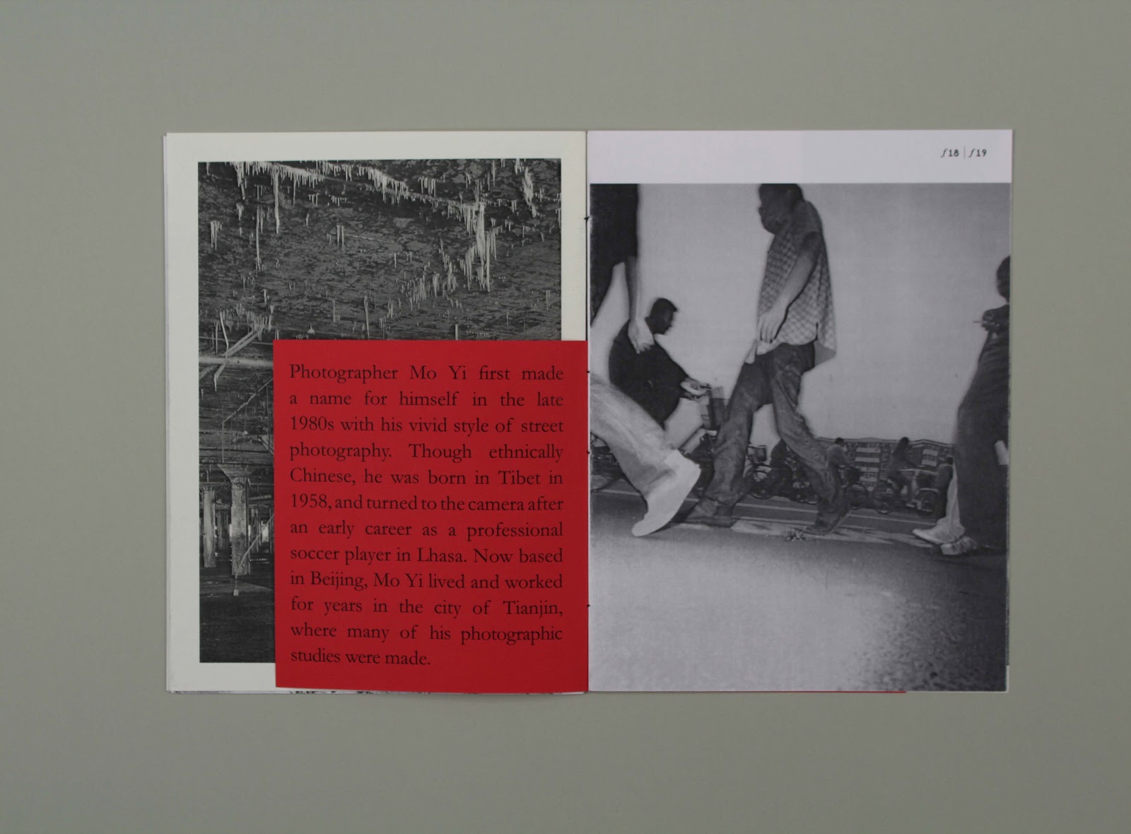
The garamond "f" is also the symbol for camera aperture and I incorporated this into my design as a nice little touch for page numbering and article stops where necessary.
Stock break up.
I tried to break up the stocks to show represent different elements of how my aricles read, I tried to put image on ice white while putting the text against china white (a slightly off white). This was also a clear separation between the content visually its subtle but noticeable to help differentiate content.


The article that broke the rule:

This is the article that broke my rules, due to the nature of its content I had to actually put image with text but the image was such a small long strip I allowed it instead of rethinking everything. Despite that this is my favourite double page spread.
The red stock
The red stock signified the light from a photography dark room and worked beautifully with the black and white content giving a extreme contrast that still worked incredibly well together. It made the publication very striking and eye catching.
Subscribe to:
Posts (Atom)