Fonts:
Palatino Regular & Bold Italic.
Me and matt both decided that this font would represent our brand the best, its a high end serif font, not too formal but connotes quality. I decided to use the bold italic in combination with the regular as they sat really well together especially on a minimal layout.


Document Set up.

Square span was the best decision for image driven layout in my opinion, I fully knew that this would be a A3 Cut down size so I just kept the margins the same as normal as I this gave the image a bit of breathing space on the top and bottom margin and didn't feel as cramped as a tighter margin would. The gutters were standard aswell, even though I knew there wouldnt be much text I just put it in as a guide.


Using ruler guides it gave me a little bit of structure within my layout, I generally just use these on the odd page as a guide when something does not look right. Always handy.

knowing that its on A3 cut down I used the margins as a guide fully knowing it would still print, so i utilised this for the page numbering system.
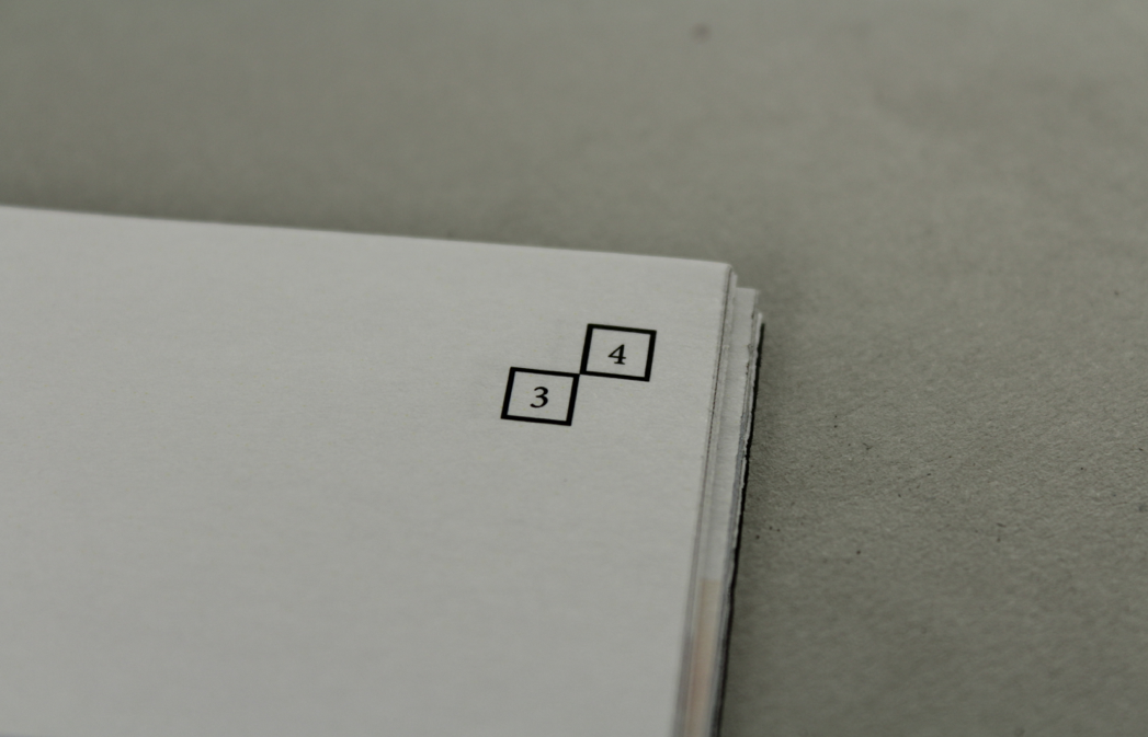
page numbers.

Section guides.
No comments:
Post a Comment