Wednesday, 28 March 2012
The wonders of Photoshop
Before
After
Basically after i did the photo shoot I already knew that i would have to hammer photoshop hard as there were multiple imperfections with the packaging but we knew that was going to happen and to make it slightly worse the lighting was a bit off in the photography hub thing.
But to try and put the focus on one object at the time I turned the aperture on my camera way down as to slightly blur everything around the focal point, this allowed the viewer not really to notice the problems in the packaging. Photoshop also sorted out the lighting pretty easily by just playing around with a few settings.
Product Shots which we ended up using
Basically im going to not upload the 150 photos i took during the photo shoot as it would be incredibly excessive but yeh i took a lot for various reasons. The packaging came out really well but obviously they aren't perfect which makes them very hard to photography as they just dont sit that well together due to imperfections.
I booked out a set of lights and set up the little photohub to take the photo's which kind of limited me for space as the boxes were bigish and there were 4 of them. I knew i was going to have to photoshop loads of random edges of the photography hub out and so on as well. The lighting was also a little bit off and im pretty sure this was not entirely my vault but instead the little photohub things vault. its too small...
Only problem was that we ended up picking photos from 2 separate photo shoots, one which didn't have the lights... so it looks a little bit off on the boards.
Project management & Idea's
These are all my initial ideas for the YCN, some thumbnails and that ever important project management.
Wednesday, 21 March 2012
Final crit
We took some good feedback away from this crit but due to the nature of the design of the box we weren't able to change much but we were able to start capitalising on some of the considerations of placing the product in a store and in a real world scenario.
Idea behind Foam.
The idea behind putting high density foam in the packaging was that, well google does not really have an physical presence so... yeh its a bit hard to shove somehting in a box. BUT, we decided on packing the cards in high density foam which gave the whole idea that the contents were precious and valueble, even though it was just a card. But we figured it would tie in well with the products as the google products are valued incredibly high, without them the internet would be much different.
The cards sit very snug in the foam as well and contrasts nice off the blue packaging corners so it was a overall win in my opinion.
Interactiveness with the box
Heres an example of opening the box and being able to scan the QR code which will then redirect you to the mobile site.
Tuesday, 20 March 2012
2nd Proper mock up (Google Search)
The simple icon and title on the top of the box was informative enough to make the customer know that its Google search. The information on the sides of the panels just needed to be centred a bit more but they worked well as to inform about the project.
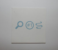
The icons on the top of the Card kind of repeated the panels on the side of the box and wasn't clear enough what the card was referring the customer to so me and ben decided to redesign them to make it a bit more clear.
The QR code and the URL were very clear just needed to work on the top of the card.
1st mock up (Google Plus)
Didn't like the Google title on the top of the box as it was just repeated on the side again, so it would potentially be a good idea to use an icon or something referring to the individual product rather then the brand, this way you could easily pick apart the boxes from top view.
Net Redesign
QR Card Redesign.
I didnt like the Google 'G' with all the colours on there so i just quickly did some mock ups with little logo's on the top of it. Figured if the information is on the outside of the box with the panels, people would kind of get it when looking at the card. Also put a URL link at the bottom of the QR code incase someone does not have a scanner which is fairly likely.
Vector icons in relevant colour schemes.
Heres a redesign of the 4 new boxes all following the same layout rules. Ben came up with a much better packaging new which reduced the amount of bad corners on the actual mock ups due to this design.
Overall this is much simpler and cleaner then the previous design directions we were heading in.
Logo's and Icons
Logo's for Each Box
Icons
These are some of googles existing logo's and some new logos we made. We also color coded them to fit into the range.
Subscribe to:
Posts (Atom)


