


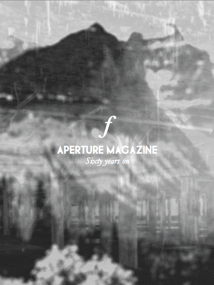
After yesterdays crit it confirmed my previous worries about not having an image on the cover and that I had to incorporate photography. The problem was I did not want to be bais towards a single photograph across 60 years of the foundation. So what I did was take a set of images into photo and give them an aperture blur & half tone effect. This allowed me to play around and make the images not really as clear as they could be but mainly focusing on the light. I then overlaid them over each other and produced an image type collage. This has allowed me to produce a nice looking image for the cover while putting the focus on the type and most importantly not be bais towards a specific photographer.

Reworked cover "logo" I decided to drop the lines as said in crit they reflected a lot of nothing so realistically they aren't needed. I added the F stop sign in to reflect Aperture this is something I will be running throughout my magazine with the page numbering. This should be much more relevant to my photography audience as well.
No comments:
Post a Comment