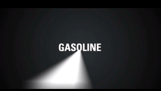
This is screen grabs from "The Dark Knight - Kinetic Typography" video on youtube. I took screenshots at the significantly important parts of the video to try and show the changes in motion of the type. The video is a really good simple example.
Type kind of builds
Then angles to start the new scene
The out of focus line helps illustrate the "gasoline" being far away.
Scene start point
Builds the shape.
Then the shape is enlarged and angled to set the next frame up in the centre using white text again.
Again the text is enlarged grey'd out and pulled towards the screen to make it feel like its coming towards you.
Angling type at right angles gives a 3 Dimensional feel the it.
Giving the idea its coming from infront of the screen again with grey'd out type giving the feeling of a 3D shape


No comments:
Post a Comment