Monday, 23 May 2011

Speaking from experience second book design

After my 1st crit it was basically said that i had to change the colours of my book to represent food and lunchtime better instead of different shades of brown. This was very clear that i had to do this as my book looked very boring. This is the 2nd set of book design ideas i made.


This book again wasnt good enough in my opinion it looked far too boring, simple and structured... i needed to rethink the redesign and try and make it more relevant to my audience. 

I decided to print out a rough copy to see what it looks like as a physical book to try and get a different prospective of it and to see what design techniques works on the screen but not on physical paper. this illustrator way of printing worked well but didn't give me a massively accurate idea if it would work until i printed it.


Designing this book gave me a few ideas for my next redesign and mistakes not to make when double sided printing, as no matter how accurate the printer theres inevitably going to be a mistake, either in the layout or the book binding process.

This was so very plain and urgently needed more colour and different layouts and fonts.


This book basically wasn't appropriate for the subject matter or the audience, it needed a more light hearted approach and a full on redesign. I decided to look back to my initial context boards to try and get some more inspiration and idea's

using the harabara font, i didnt like the look of this font after adding colour to my booklet it made the text feel bold and the black seemed to always overpower the page against the coloured text. 

after switching to helvetica. This made the black seem much less overpowering and helped my information sit back on the page more. Which isn't necessarily a good thing as it could mean now all my content looks the same and boring... at this point i started to realise i will have to do a full book redesign.

I tried using a colour scheme of greens with helvetica but the dark green didn't fit well either and my booklet now started to look like some weird lettuce menu at this point i decided to take a break and come back to my booklet at a later point because what i was doing was not working at all.

Sunday, 15 May 2011

Speaking from experience Book

I decided to take my previous idea forward and instead of making a load of booklets to condense it all into one. This would allow me to voice the general opinion of the class all in one book. I figured it would also be more likely that my audience would browse through one book instead of 6 different ones which was the case of my last idea.


This is a very unfinished rough layout of the book so far split up into double page spreads. The colour scheme is very dull and low end printers do it even less justice. to make this idea work better i need to rethink the colour scheme and some of the illustrations. The book is split up into various sections: tips, facts, opinions and then some statistics which i gathered. I decided instead of bombarding year 1 with loads of information to condense it a bit and give them the more helpfull bits. 


This is a book matt got in his lunchbox one day, its layout and design was fairly simular to what i was producing already, so i used it as a reference for double sided printing, By numbering these pages and then laying out my book like this one in illustrator it helped get my pages lined up correctly.


Speaking from experience

I decided to try and make an individual booklet for each shop, I wanted to colour code each booklet specific to the shop i was reviewing. These booklets could then fit into a mailshot which could be handed out into 1st years pigeon holes.


I decided to not push this idea much further as it means an absolute ton of work and i didnt have enough interesting information on each shop to make it work properly.  


Some layout ideas and info graphics i attempted to see if it would work in my book layout but in my view it didn't the colours didnt work with the stock i put on and the infographs seemed rushed. A lot of the content didnt seem to relate to the content i was designing and it didn't really relate to my audience.


Speak from experience


my initial idea was to make a load of card type flyers which would contain all the information on each shop. I would make one for each shop and place it together in a folder which you can then pick which shop u want to have a look at.


I wanted to use photography within each card but after a bit of work i soon realised that this idea wouldnt work as images places on the background contrast really badly, i would have to have to keep photos in black and white and keep the background dull to kind of make it work. so i decided to move forward and explore one of my
 other ideas.


Some initial quick cut outs to see what size i would be working to, i disliked the form of these and just the way it would represent information. 


These are some initial scetchbook pages which helped me form ideas for how to present the content i had to deliver and what kind of ways to go about it. 


Friday, 6 May 2011

Speaking from experience


Research

tesco's

opposites

coffee rand

miro

cool beans

charco's

flames 

cooplands

USA chicken

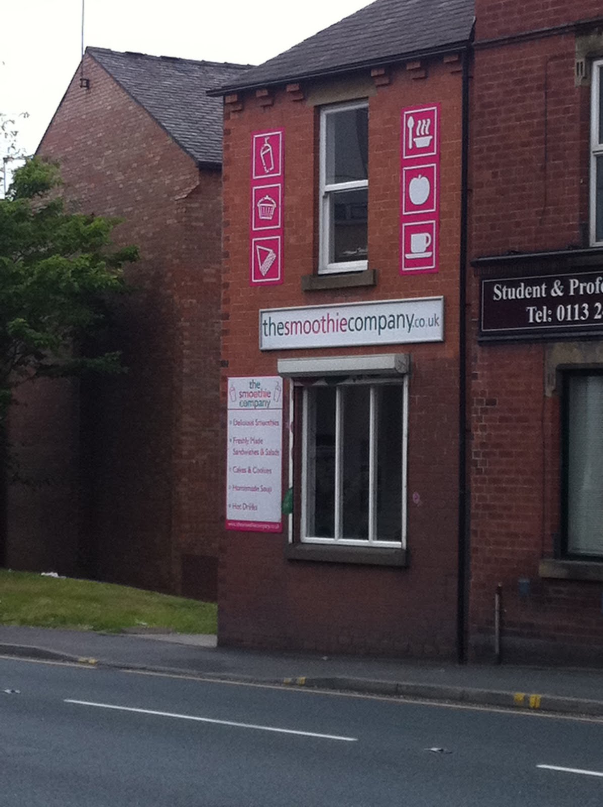
Smoothy company

mosaic cafe
Bakery 164

Rough timeline to how long it takes to get served 

Average prices 

 What year one prefers

 Prices and ratings

 Helpful facts

 Some of year ones quotes and preferences 

Quotes 

 Quotes

 Facts

Facts

MAP!