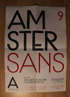
Fold out posters to promote my typeface. Initially this was a great little idea but the problem with producing this is my typeface wasn't key able so it made working ridiculously slow and making any form of body copy practically impossible so I was limited to using a 2nd typeface for any writen body copy. As well as not really have a lot of content to put on the poser per typeface I kind of kept going and it resulted in me producing some horrible boring fold out posters which were basically just a piece of A3 folded down....
This poster felt cold, boring, plain, empty and reminded me of a street sign.
bad layout.
The inside of this poster was nice. but the folds ruined the integrality of the image.


No comments:
Post a Comment