Thursday, 29 November 2012

different front cover variations

I couldn't make up my mind on what cover to make for my type specimens so I made some grid related ones and tried a few variations on the layout. 


feels unbalanced

yes

no.

really heavy black, makes the black the focus point not the grid.

needs to be more consistant with the rest of book.

Some more cover variations.

I made some with the actual typeface letterform on the from, these came out alright. 


Book and fold out poster per typeface


Initially I had the idea to produce my type specimen book which has a poster attached to it. but then realised this is completely pointless... where would it be handed out and more importantly who ever got given it would be dissipointed. Nice idea for the future, but mayby with different content like a grid based book for type. 

Wednesday, 28 November 2012

poster development...


Open publication - Free publishing - More amster

I had a lot of trouble getting these posters to work, they all just felt too empty and not complete, this has kind of made me realise that im a much more visual designer in the sense that I prefer using image as a primary over type. That and I did not have time to screen print these and they were looking really boring for digital print, nothing really interesting about them not even the process.

this has made me rethink the posters a bit and incorporating more image into them.

Poster Layout


Open publication - Free publishing - More modern no 4

just playing with some layout, but Thierry's photos are really solid, really brings the typeface up to a professional standard

Tuesday, 27 November 2012

First Draft of my type books for 2 of my typeface


Open publication - Free publishing - More modern no 5

After my crit with Andy he made it obvious to me that the covers on these looked a lot simular to my Aperture ones which I cant believe I hadn't noticed, must be the time/pressure getting to me a bit. But other then that, this is just a quick run through of some type specimen books I made. First draft anyway.

Monday, 26 November 2012

Lookbook first draft


Open publication - Free publishing - More clothing

Print Test of first draft: (black & white saving them money's)

Cover does not do it any justice, need to get thicker stock to show the difference between outside and inside. 

Bind works well and allows flat folds. 

An image flushed first page would work a bit better, also making the text collumn line up with the logo will give it more structure.

Printer failed to do these pages right, should be a half flush page of image. Keep this in mind when printing proper one.

Again printer messed up this page, but not sure how well the image on the left looks, slightly obscure, prefer something more relevant. 

Reduce text collumns to line up with logo. 

Rearrange images to line up, do not like the zig zag layout. Aslo no text keep it simple. 

Flushed image last page would look better then a half image, feels like there should still be a next page. doesnt feel like the end of the book. 

Lookbook planning

This breaks down the potentail different sections within my look book as well as a page breakdown over view, this page breakdown is probably the most important thing I do when planning a book, it gives me an idea of what kind of content I need to source. By doing the photography myself besides additional stress it gave me the unique opportunity to plan all my shots and layouts before going at the lookbook. I was basically figuring out exactly what i needed to take and how to take it to make the design process easy. 

Square span.
I decided to go for square span, 20cmx 20cm for my pages in my personal view and from what i have read in various graphic design articles. Sqaurespan is the way forward for image heavy pages. I agree with this as I feel layout geared towards image heavy publications work far better on square span.

Bind
I realised that I did not have the time to sort out a perfect bind so I kept the page numbers down to a maximum of 34 to allow me to do a stich bind. This allows me to fold each page flat while at the same time not go through the hastle of doing a perfect bind. I used black thread which went well with the inside cover and the over all look of the publication.

Concept
"Self Made"
There has been a lot of buzz especially around leeds about the self-made business'. After speaking to dots at the start of the summer I also massively appreciated the effort the guys went through to start their own business and their strive in quality. 

The concept for the Look book is broken up into two section's but overall connotes Self - Made. The start section is a taster for the Autumn/Winter collection where the 2nd part emphasises the effort and processes gone through to produce each piece of clothing to hopefully show our customers that we dont just sell clothes but we make and sell them. 


Rough outlines of some of the shots and apertures to take from models and pairs of models. 

Lookbook Development


Open publication - Free publishing - More lookbook

My work flow for image driven editorial usually starts with a few scribbles followed by shortlisting all the images, followed by breaking up all the images I have shortlisted into relevant sections.

I will then get my grids, guides and page navigation's up and then utilise indesign to start mocking up layouts. Doing this allows me to do a ton of pages then export it as a PDF, stand back and browse through what I have done. This is good as when i go through all my pages I can instantly see what doesnt work with the flow and what does, this then results in me going back rearranging the pages which work and throwing out and rethinking the pages that dont work.

This mock up is broken up in 3 sections:

Autumn Winter
Products
Self made.

After looking through this I basically decided to scrap the products section as it felt like a really random change to the first section especially in a photographic way. This section was suppose to illustrate the products with objects relating to the clothes but I ended up running out of time and not doing it well. These photos were then used for all digital promotion and purposes of showing the clothes.

Self made section, I did this in colour then in black and white, I much prefered the black and white as it felt more tradition and allowed the images to fit together a bit better especially as they were shot over a few days with different amounts of light. 

Sourced Photography for typeface - thierry sewell (Photography student)


been talking to a photographer who has let me kindly use some of his images for my project to put my typeface into context. Going to make some quick magazine covers with this and poster layouts

http://thierrysewell.tumblr.com/

Lookbook breakdown (Grids, layout, design desicision, Concept)

Fonts:
Palatino Regular & Bold Italic. 
Me and matt both decided that this font would represent our brand the best, its a high end serif font, not too formal but connotes quality. I decided to use the bold italic in combination with the regular as they sat really well together especially on a minimal layout. 


Document Set up.


Square span was the best decision for image driven layout in my opinion, I fully knew that this would be a A3 Cut down size so I just kept the margins the same as normal as I this gave the image a bit of breathing space on the top and bottom margin and didn't feel as cramped as a tighter margin would. The gutters were standard aswell, even though I knew there wouldnt be much text I just put it in as a guide. 


Using ruler guides it gave me a little bit of structure within my layout, I generally just use these on the odd page as a guide when something does not look right. Always handy. 

knowing that its on A3 cut down I used the margins as a guide fully knowing it would still print, so i utilised this for the page numbering system. 


page numbers.

Section guides. 


print and evaluation

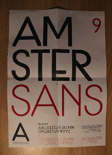
Fold out posters to promote my typeface. Initially this was a great little idea but the problem with producing this is my typeface wasn't key able so it made working ridiculously slow and making any form of body copy practically impossible so I was limited to using a 2nd typeface for any writen body copy. As well as not really have a lot of content to put on the poser per typeface I kind of kept going and it resulted in me producing some horrible boring fold out posters which were basically just a piece of A3 folded down.... 


This poster felt cold, boring, plain, empty and reminded me of a street sign. 


bad layout. 


The inside of this poster was nice. but the folds ruined the integrality of the image.

Poster development

Rearrange to be opened portrait apposed to landscape.


place text to make the reader reorientate the poster portrait.


Printed the wrong way around, rearrange design to work.


Poster delivery Development For Amstersans

Sunday, 25 November 2012

Embroidery

Stephanie Rose Turner (textiles) was a great help during the embroidery part. Equipped with her high end sewing machine she managed to sew a range of our clothing labels for us. After wasting some clothes through offprints we reused them and printed labels on them for the special one off range, this range was the dip dye's and the jumpers where we werent able to do inside tags. Tags also gave our clothes a much more professional look 


Team work, Today we worked like a fine tuned machine.

Round 2
After our first session we managed to waste a lot of stock clothes (which we did use for labeling and so on so we didnt waste that much at all) but this time is different, we knew what we needed to do and how to do it efficiently. to say the least me and matt worked as a solid team, we didnt really mess anything up this day, it was a bit confidence boast and saved a ton of time. 

During this session we did a lot of the logo Tshirts and we did all the inside tagging. our management for this session was really good, we tallied up everything we needed to do and made stacks of clothes for each type of print making it quick and straight forward.