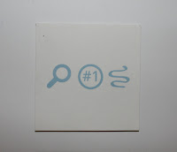
The simple icon and title on the top of the box was informative enough to make the customer know that its Google search. The information on the sides of the panels just needed to be centred a bit more but they worked well as to inform about the project.
The icons on the top of the Card kind of repeated the panels on the side of the box and wasn't clear enough what the card was referring the customer to so me and ben decided to redesign them to make it a bit more clear.
The QR code and the URL were very clear just needed to work on the top of the card.


No comments:
Post a Comment