Saturday, 28 January 2012

Final Sequence so Far


This was my first few hours of animating on my final sequence i got much quicker at it as i started to get a style down but yeh, things wrong with this video. I had too much shadowing and the transition between the title screen and Egypt is a bit choppy. The nature of this scene made it incredibly hard to animate especially a first scene.  I should of done the title screen as part 1 then cut to the 2nd scene for egypt instead of having two sections, one going forward and then one panning to the right with panoramic layers.


Here i took down the amount of shadowing and added a light into it to spot light my target area. I dont like the type in the egypt scene, it feels too light and like it doesn't balance with the rest of the scene, i need to potentially change its colour and increase the pointsize to make it fit better. Feels like its just kind of sitting on top of the scene and not mixing in well enough. Maybe incorporate it into the sand layers?
Also some of the structures are parented with sand and other aren't, either parent them all or none of them but looks a bit odd.

Wednesday, 25 January 2012

Ident experiment


Basically after speaking to lorraine i got my files straight and sorted out a lot of errors in my file keeping. The original test video's i cant upload to vimeo for various reasons but i have also sorted that out. The problem with this video and the reason i very much dislike it is due to the camera not panning smoothly, after watching a lot of tutorial video's i did eventually sort it out but i got very very stuck today so i just gave up and did it the simple way which comes out not very well...

Basically i went away and thought about the way i was working and realised i need to take a step back and simplify everything down otherwise i would try and produce something after effects was not made for and it would actually make this project really really hard for me.

But this experiment pushed 3D to its limit in after effects so now i kind of know where my limit is... now to step back and keep my sanity.

Ident in progress 1


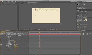
This is some Screen Shots of my first attempt to make an ident but after finishing 1 i wasnt very happy with the result at this point i still needed to work out a better set of rules to work to. The way i was animating was far too complicated still. Using the XYZ axis effect on a null object seemed to help my camera pan more smoothly but it also brought a world of majour confusion along with it. so i decided to stop doing idents and take a step back and rethink my intire style. Mainly to simplify it so i could get a good qaulity animation done in the time set instead of stuggling with far too complicated tecniques.


Tuesday, 24 January 2012

After Effects session


dots on the line represent amount of frames taken to control the pace.


Ease out*


Various keyframe assistant movements

Graph Editor


Establishing parent child relationships


By selecting a perant all the child layers will follow it around as you animate it like it has been grouped. 

Nesting compositions


Collapse transformations switch when working with nested compositions get rid of the bounding box incase it cuts some of your artwork off.

Audio


Monday, 23 January 2012

Animation Tests (Depth of Field)


Experimenting with field of depth. 

These are some basic Test animations just seeing how the camera angles work with all the different settings, using a background layer gives the animation a feeling of depth and 3D. A problem i have encountered on AE is when using the 'Orbit' tool on the camera. As soon as you use it the camera does not more linear anymore and it messes up pretty much everything within the animation.


Without a background layer it feels much more flat but it also allows me to plug in any background i want or to do any camera animation. 

Type 2

We had to apply our researched typeface to a logo or brand which was simular:

American Apparel was one of the closest logo's i could think of mainly as the weight of the typeface was the close, Topshop was another Brand which was close. We then had to pick a brand which wasnt simular and i picked billy's burger bar, which is a takeaway in headingly. The orginal typeface was horrible and futura actually made it look a bit better, but on reflection a sans serif typeface of this weight could actually kind of work on a takeaway so its probably not the best example. Something like Jack Wills would be better.


The next task was to do a hierarchy for a yellow pages add. 
Because the Add was 30mm x 20mm so its very very small for the content. But the minimal point size to use is 7 otherwise its too small to read. 


Typeface Research

This is my research for the typeface futura, all the information i put on for futura is very physical, looking back at i would like to of put down more meanings for the characteristics the typeface shows. 


Type Session 1


Sunday, 22 January 2012

Backgrounds


Well helpful to produce a looped background. Not sure what jesus and AE have in common but still really worth looking at

Friday, 20 January 2012

Possible intro image

Made this in photoshop and i will probably change it up to animate the specific elements like the text to come in letter by letter then go for a close up shot to change the scene.


Some initial story boards for the intro. 


Wednesday, 18 January 2012

Crit

Feedback was helpful, but it was hard to clearly show everything i wanted to do as i got stuck figuring out a style of animation but i have managed to kind of crack it a bit. Helpful points which were brought up are putting facts and figures about each of the structures im going to look at into my video's which was one of my idea's just got stuck animating it, so my next step would be to look at how i can integrate my facts into my imagery and if i need to get a new typeface for it.

Sound - I have a track i really like, its subtle and need to select a specific section of it i want to use within my animation. I dont think im going to add any additional sound effects, i dont think its necessary.

To do.......
Story boards, now that i have got my style cracked i can get on with storyboarding my scenes as i have a far more clear visual idea of what i want it to be.


Sound


Song from Bonobo, i really like this song because its just subtle background music and it feels like it's building up slowly. If i were to use it i would probably consider taking a 60 second section out of it from about 30 seconds in, so when the bass drops at about 45s i can get the animation to move with it.

Test Animations (Camera Panning)


After moving through a couple of cloud layers Type is visible.

Might need to arrange type so it would hit the camera dead on when moving through it.


Heres an experiment i did which takes my camera through various sets of cloud layers produced in photoshop, it looks pretty interesting and its kind of giving me an idea what to expect from a camera when moving through objects, especially when moving through type. 

I used a very colourful style of animating while blacking out the images with the tolerance setting. This seemed to come together but i was not sure how relevant it was for a documentary so im going to go away and rethink my approach to using image.

Tuesday, 17 January 2012

AE

1) Source Text:


*********

2) Start and the End - what percentage of text will be effected by the chosen animation


*********

Advanced options


Index allows you to work in units relevant to the number of characters

********

Scale Ancor point advanced options


Add more options...................


Editing the smoothness of colour

layer masking a path for the text