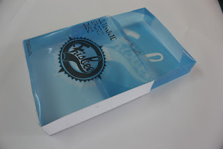
I did like the colour schemes used in the minimalist packaging it works with the acetate and allows the type to show through i also liked the typeface so i decided to take it forward and give it a slightly different look while keeping in mind the acetate cover and how it would influence the final look. From the generic dark packaging i liked the logo in the middle so i decided to transfer that to the acetate packaging. Also instead of having a front cover on my box and then putting the acetate sheet over i would remove the front cover and make the acetate cover fill it that way you could also see inside the box.
This is roughly an example of how i started to lay out my work, with the acetate cover so i could actually overlay it on my packaging to see if it would work.
This type of packaging seemed to be more together and if i used a grainy or textured brown stock it would work as a bit of a backdrop to help my logos sit better on the page. The bottom left image would be the sleeve which goes into my box to actually hold my frisbee.
After going to various shops in town i could not find the stock i wanted.......... and definitely not in A3, i realised england has a massive gap in the market for this kind of thing. That and i dont want to mention the shops which i did go to because the stock they had were so overpriced for what they were.
After going to various shops in town i could not find the stock i wanted.......... and definitely not in A3, i realised england has a massive gap in the market for this kind of thing. That and i dont want to mention the shops which i did go to because the stock they had were so overpriced for what they were.
Idea of my set of 3 with coloured acetate covers which would help keep my range consistant.
I decided to start doing some more mock ups to see what things would look like and to see if it would actually work.
Some inside sleeve mock ups
This light card stock worked the best when it came to letting the actual type on the acetate show through.

This started to actaully work, the stock and the colour range seemed to sit well although it started to become a bit boring when it came to colours...

This gave me an idea of how the series would work along side each other. At this point i still felt the packaging was a bit... dry and needed something else like a good backdrop to it. Still felt very "1st year" to me and i wasnt happy so i decided to keep this template of packaging and further develop it. I realised with the type in these boxes i could easily just overlay it on an image or simple backdrop.


No comments:
Post a Comment