Monday, 7 March 2011

Type Anatomy

This was my first poster almost resolved, i changed the stock colour to make it less harsh against the text and i made the image more bold and enlarged it to make it the focal point. The text i put to the side and condensed it, this worked better then just letting it float in the middle of the poster.

I tried to put lines to be more specific about which part of the drawing was relevant to text but it started crowd the page too much and just was not visually appealing so i abandoned the idea.

For my 3rd poster i simple just put the two enlarged drawings on which were separated by shapes and text which explained what it was about. This separation also illustrated the idea of A and Z being opposites. 


Final product on cheap stock, i would like to print them out on antique white stock to break up the white background, for this one i just put a background layer in illustrator to give a idea of what it would look like on the antique white stock.


Type Anatomy

After my final crit on friday i got some feedback which advised me to deconstruct my A and Z and to show the difference between them like that and to choose a more specific audience. I went away from the crit and did some more research into my A and Z and came across a lot of notes about what goes into a letter form to make it and from that i started to construct an informative poster which would show the difference between an A and a Z based on what they are made from.

These 2 posters were my starting point and i played around with the information i had to try and get a set of rules to work for all 3 posters. I picked a set typeface for both the Z and the A, ones which were fundamentally different to show that they are opposites. For the image i then placed the A in guidelines and highlighted the area's it was different and then explain what each of those area's were underneath the image. These two posters were a bit to dull, i need to work on breaking up the black grey against the harsh white stock, potentailly experimenting with some off yellow stock would make the contrast less harsh. Also break away from the standard paper size and try a thinner rectangle to hold the information.

Thursday, 3 March 2011

Opposites


These are some of the ideas i took onto illustrator, need to play around with colour schemes. I feel they are all took simple and they aren't clear enough. I am planning to screen print my final three so i can a more grainy look to them.


This is one of the tester screen prints i did. The black A contrasts well against the red back ground and you can clearly see the difference between the A and z by size and colour, the triangle helps to relay that information as well. 

Opposites

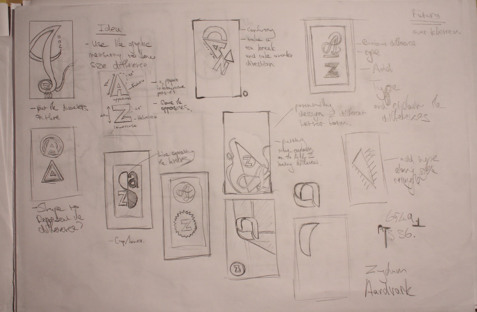
initial ideas for producing A and Z as opposites and ways to represent it.


my 30+ thumbnails experimenting with different layouts


Ideas for my final resolutions to produce the type anatomy posters and some feedback from corrections to make on them.


Research

The image doesn't want to properly paste but its the PDF in the helpful resources section on moodle.

http://portal.leeds-art.ac.uk/moodle/file.php/77/BOOK_COVERS/Fontastic/typeface_anatomy.pdf


Tuesday, 1 March 2011

Book Fair


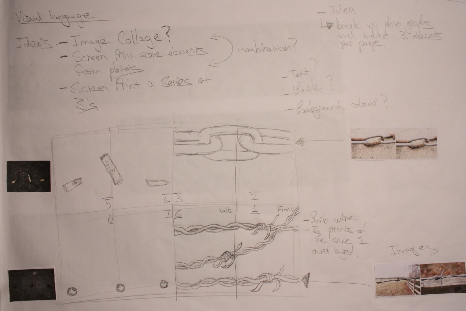
These are 2 of my initial ideas. I wanted to do a screen print type college with elements i got from the photos i took, but i then quickly dismissed this idea as i couldn't find a interesting or engaging layout with the elements i had.


Another idea i had was to do a triangle book, which would use triangles in different colours and layouts but after i had produced a couple of moch ups i didn't like the simplicity of the book and felt like it was just not interesting enough especially if i did digital print.

Book Fair

Personal Grooming Handbook
After my initial idea failed i decided to use one of my other ideas, producing a personal grooming handbook for men. I would give three examples of breads/moustaches/hair per double page, i would also leave quotes relating to it. I wanted to have a play full theme in this book as well so i made the typeface and vectored images appropriate 


The blue and green look really good but they dont contrast well with the grey.


These are some of the stock and type colour variations i tried in the end i liked some of the other lighter blues but i decided on sticking with the brown as it contrasted the best with the white and the grey.

This was my initial front of my book but i then realised the book doesn't need a title and that its fairly self explanatory.


I like how my final product of my book came out as but if i could change anything i would stick to a different stock the antique white made the working look less harsh but it also reduced the visibility of a lot of my text a bit. I would also of used different background colours, the dark brown grey and white scheme works but some of the other colours were much more playful and would fit better with the humorous theme i was going with. The book did look a bit bare inside in the end would of helped if i added a bit more content into it.  

Book Fair

This was one of my first idea's i decided to quickly do a test print to make sure it would work as i havent done lino in a very long time. The idea i had was to use the lino print method to give the book a very fun and play full feeling to it to go along with my theme of 3 of a kind. The printing method would also give the book some form of authenticity.
 This is a small A5 piece of lino which i would test a double page spread of my book on to make sure the text and the image worked in the style i was going for. 

Tracing onto the lino with pen to try and be slightly more accurate.

I had already messed up the "three" on the top by cutting out the outside of the letters instead of the inside. This was annoying but it was only a test piece. The cutting out was slightly less accurate then i hoped but still worked well.

I realised after printing that the Text would invert... I was also not happy with the texture of the print. I could of fixed this by scanning in the image and inverting the text on photoshop or just printing out a invert copy and tracing it on, but i decided against this as i could take too much time. 


These are some of the design sheets i produced while trying to work out some of the different layout and what to actaully put inside of my book.