Sunday, 12 December 2010
What if... Logo, poster and flyers
After we decided on the typeface creating the logo was simple, i got a friends permission to use some of his wall space outside. I got 3 different types of wall texture to make sure the type came out properly. Then as a group we photoshopped the image into a frame to make it more relevant to a gallery.
We decided to keep the poster simple, the logo in the middle with contact details on the bottom.
The flyers would have some of the best graffiti we found on the front and then contact details on the back these would be distributed anywhere to the general public.
What if... Website and blog
This is the welcome page to the website it has a twitter feed and an area to submit your work and the area it is located in. It also showcases some of the best graffiti we have found so far. It gives information where to e-mail or contact us to submit work.
This is the homepage of our blog it has all the images on here split up into locations around leeds.
By clicking on one of the fullscreen images it directs you to google maps with a pin on the exact location that piece of graffiti was found.
The website and blog worked together well as artists could get there work up easily and then the public could view their work. One improvement to make would be to get a way where random artists would be able to upload their photos without necessarily going through us first making it quicker to get their work up and noticed. I would also like to produce a series of posters which would tell people about the website and what we are trying to do, this will hopefully get artists on the site noticed more quickly.
What if... Progress Crit
We presented initial ideas and our problem in the progress crit which was "we intend to make graffiti more socially acceptable" we wanted to set up a gallery in town and get artists to submit their work, but it was stated that it is a live brief and we wouldnt be able to get a gallery sorted in time. Someone in the class mentioned it would be good to do a website gallery which showcases a lot of the work and the different locations we found all the good graffiti.
We went away from the crit and worked on this idea we came up with setting up a website and a blog where people can then freely submit their work to us and we would post it online. The gallery would showcase the best graffiti we found in leeds separated into locations, you could then click on the photos of the locations u like and it would direct you to it in real world via google maps.
This gave people the opportunity to actually go on a day out and see their favourite graffiti art work and appreciate it in the real world.
We decided to promote our website via flyers and posters we would put up next to some of the graffiti areas this way artists could actually see our website and hopefully submit more work to us. One of our main aims were that people could also go on the website find a style of graffiti they liked contact us and we would then be able to get them in contact with the artist to hopefully get him some commissioned work.
What if... Research
From the research we did as a group we decided that we needed to get graffiti out into the public more. The feedback we got from our questionnaires showed that most people didn't like the "tagging" type of graffiti but they were much more open to the good graffiti which took skill and time.
We realised the problem main problem the public were concerned with graffiti was the tagging on public property and other places were it actually damaged the environment. As a group we decided to tackle this problem by attempting to make graffiti more socially acceptable.
We intended to do a gallery showing in town which local artists could come along to and submit their work for the public to appreciate their work as an art form instead of vandalism.
Monday, 6 December 2010
Visual Langauge The Number 3
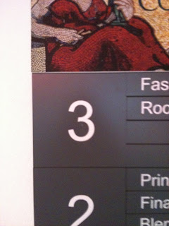
These are the initial first photos of 3 i took around the College.
These are some of the other photos i took which all had 3 of the same objects in.
Subscribe to:
Comments (Atom)


